


We start with discovery, understanding your users, business goals, and the context the product sits in. From there we map out information architecture, user journeys, and interaction flows. Once the structure is agreed, we produce wireframes at varying fidelity levels to validate layout and navigation before any visual design begins. The process is collaborative throughout, with regular checkpoints rather than one big reveal at the end.
Yes. The depth of testing depends on the project scope. For most engagements we run structured feedback sessions with stakeholders and, where possible, with real users. For larger product design projects we can facilitate more formal usability testing including task-based sessions and think-aloud protocols. Testing findings feed directly back into the design before handoff.
Yes. We regularly work within existing brand systems, design tokens, and component libraries. If your guidelines are well-defined, we’ll work within them. If they’re incomplete or inconsistent, we’ll flag what needs clarifying and can help extend or refine them as part of the engagement.
Yes. We handle the full design process from information architecture and UX structure through to final visual UI design. These two phases are connected, we don’t hand off a wireframe to a separate visual designer. The same person who defines the structure also produces the final interface, which keeps decisions consistent throughout.
Yes. Design-only engagements are something we do regularly. You’ll receive complete, developer-ready Figma files with organised layers, named components, defined styles, and annotated specs where needed. We can also answer technical questions during your team’s build phase if that’s useful.
Yes. We frequently collaborate with internal marketing, product, and design teams, as well as external development agencies. We’ve worked within enterprise organisations at Domain Group alongside internal designers, engineers, and marketers. We adapt to whatever tools and workflows your team uses and integrate into the process rather than requiring you to change how you work.
Yes. For projects where ongoing consistency matters, particularly SaaS products, content-heavy platforms, or sites managed by internal teams, we build structured component libraries in Figma. These cover UI components, design tokens, spacing systems, and usage documentation so your team can build consistently without needing to reference us for every decision.
All design work is done in Figma. For prototyping we use Figma’s native prototyping tools or more detailed flows in FigJam for complex interaction mapping. For projects involving animation or motion, we can also produce specifications compatible with GSAP or Lottie for handoff to development.
Yes. Accessibility is considered throughout the design process, not just checked at the end. This includes colour contrast ratios meeting WCAG AA standards, focus states for keyboard navigation, readable typography scales, appropriate touch target sizing for mobile, and semantic structure that supports screen readers. For clients with specific compliance requirements such as government or health organisations, we can design to full WCAG AA or AAA standards.
A typical design engagement takes 3 to 6 weeks depending on the number of pages or screens, the complexity of the interactions, and how quickly feedback rounds are completed. A focused marketing site with 8 to 10 page types sits at the lower end. A product with multiple user roles, complex flows, and a full component library sits at the higher end. We scope this clearly at the start so timelines are agreed before work begins.
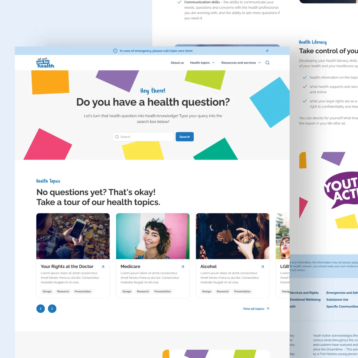
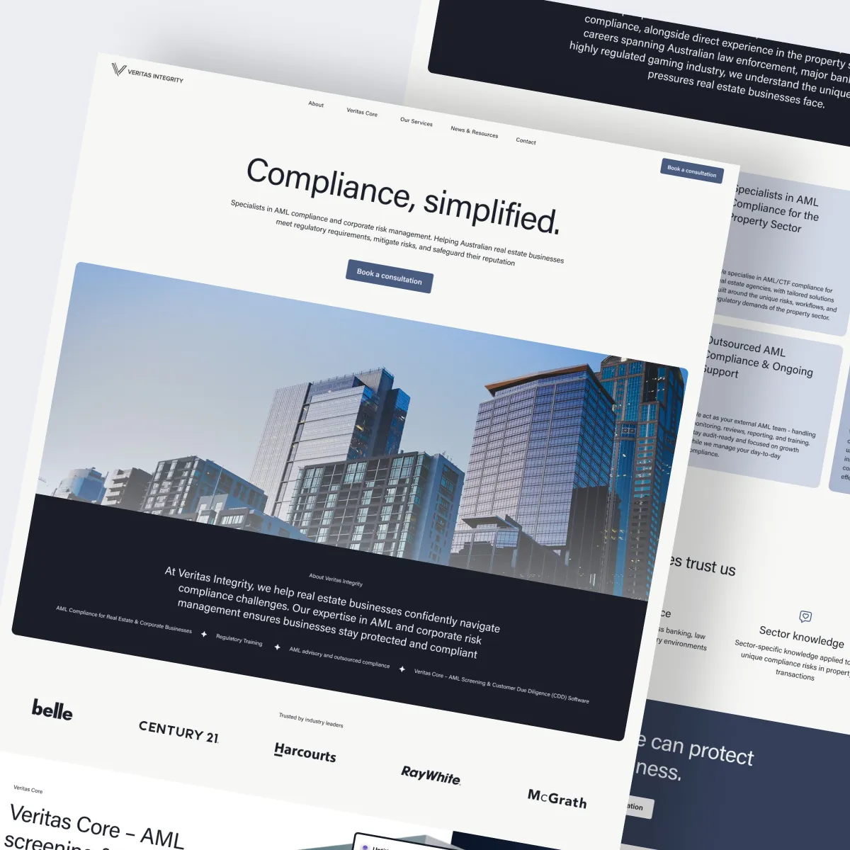
UX design covers the structure and logic of an interface, how it’s organised, how users move through it, and what information appears where. UI design covers the visual layer, typography, colour, spacing, iconography, and the look of individual components. In practice these are deeply connected and we handle both as part of a single process rather than treating them as separate disciplines.
Yes. Every design we produce covers mobile, tablet, and desktop breakpoints. We design mobile-first as a default, which means we consider the smallest screen experience at the start of the process rather than adapting a desktop design down after the fact.
Yes. UX audits and interface improvements are a common engagement type. We review your existing design against usability principles, identify friction points, and produce targeted recommendations or updated designs. This is often more cost-effective than a full redesign and can have a significant impact on conversion and usability.